Most designers will eventually settle into a particular 'style'.
Some find that illustrative graphics are their thing, others
develop a very clean minimal style, and everything inbetween. Good
designers are usually able to move between styles depending on the
client, rather than enforcing their own prescrpitive style on a
job.
I like to think that I've been able to do what's right for my
clients, finding the right approach for each client. However, I
recently found myself a little bit out of my comfort zone on a
recent project - a 180 page coffee table book for lovers of a
vintage lifestyle.
The book is Pretty Nostalgic Home, and was written by Nicole
Burnett and Sarah Legg, who run a vintage and artisan market in
South Wales. The book is a must for those interested in developing
a vintage home, from the kitchen to the garden via celebrations and
tips for buying the right stuff.
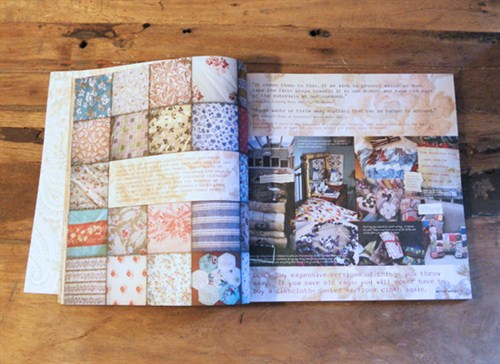
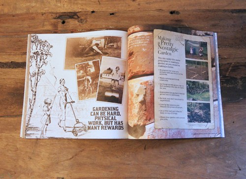
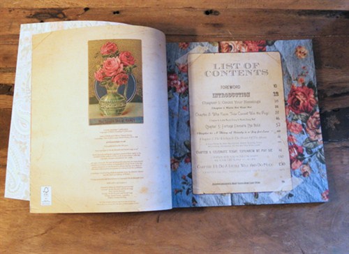
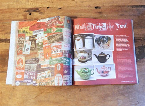
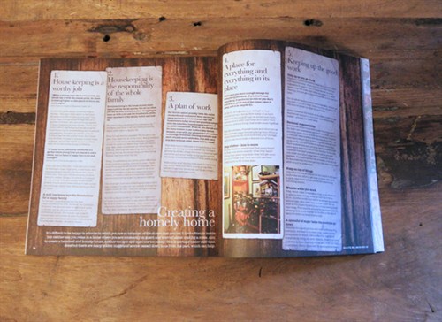
As you'll see from the images, the book required a very distinct
visual identity. The writers wanted to create a 'scrapbook'
approach, with the photos and annotations appearing as if they've
been stuck in with love. To further develop the scrapbook illusion
a handwritten font and cut out bits of paper were used to good
effect.
However, as most of my clients have had at least some semblance
of a corporate edge I had become accustomed to certain 'givens' in
my design approach - I expect everything to line up nicely where
required, I still enjoy using white space to direct the eye (my
instructions for this even included not leaving any white spaces!),
I expect there to be a distinct focus on each page - but on this
project I almost had to unlearn many of the things i've learned in
my professional career and take a step back to my days of keeping a
sketchbook on art A-level and the like.
Having gone through that process I'm very pleased to add the
project to my portfolio, not only as a creative success, but as a
lesson that an old dog can learn some new tricks, making sure I
keep on my toes and not take any styling issues for granted.
You can purchase the book on Amazon
http://www.amazon.co.uk/Pretty-Nostalgic-Home-Happy-Vintage/dp/0957133901/ref=sr_1_1?ie=UTF8&qid=1331300928&sr=8-1 .
Please let me know what you think of it.