I'm often asked what my favourite logo of all time is, and as
there's so many great identities throughout history and with
different reasons I find it difficult to say. However, a
current brand I find really effective is the UKTV brand.
You may not be familiar with the name or the company logo, but
you're bound to be familiar with the product. They're the company
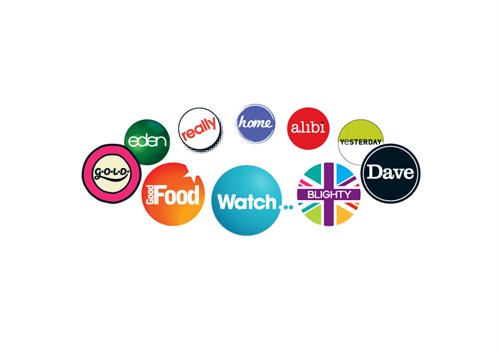
behind digital channels Dave, G.O.L.D, Watch and many others.

Why i like the brand is not for the UKTV identity in its own
right, but how each channel is represented by its own individual
icon, but is tied together through one common element - the circle.
You may not have openly noticed it before, but this subtle
iconography reassures you that you're watching a 'proper' channel,
while also remaining individual enough to represent the subject
matter or content of each channel appropriately.
Essentially, the lesson is that sub-brands and divisions need
not be simple colour change variations of the masthead logo, but
can be interesting and vibrant entities in their own right while
remaining true to the parent company's values.
www.uktv.co.uk